Bitcoin on-chain data suggests no bull market top at $60K, selling activity declining

For the very first time in a Bitcoin (BTC) bull market, not only long-term investors but also short-term speculators who usually add to the daily sell pressure toward the end of a market cycle have become increasingly confident of higher prices as they hold on to their Bitcoin.
This only adds to the already existing supply shock. If demand remains strong, this is a recipe for another leg up for the BTC price.
Bitcoin selling activity is declining again
Every Bitcoin bull market usually coincided with an increasing number of short-term speculators coming into the market hoping to turn a quick profit, while long-term speculators start to add sell pressure toward the second half of the market cycle to realize their profits.
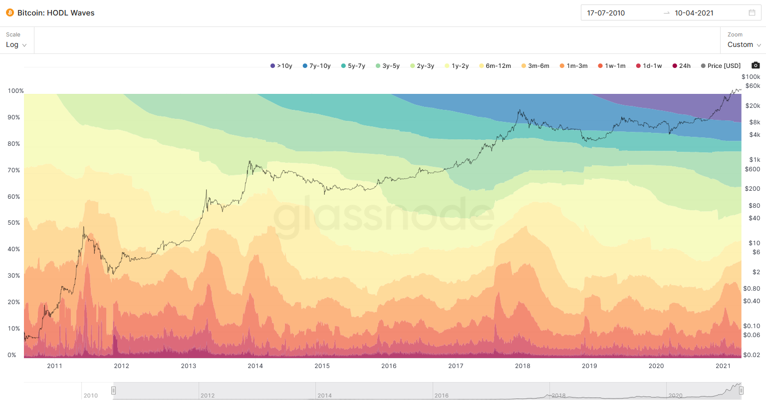
One of the best on-chain indicators to see this trend unfold in each cycle is called HODL waves. Hereby, the length at which each BTC address holds Bitcoin before they are sold into the market is clustered into term buckets that are then visualized in different color bands.

For example, someone who held on to their Bitcoin for five months would fall into the 3m-6m bucket, the light orange color band. If that person decides to sell, it falls out of that bucket and would show up in the 24h-term bucket, the dark red color band.
This means, the redder the colors are in the HODL waves chart on a respective date, the more short-term turnover of Bitcoins happens. This activity is almost at its lowest during a bear market, and at its highest during a bull market, while the short-term activity tends to peak around a bull market top.
Reflecting realized value in HODL waves is critical
Since the Bitcoin price fluctuates significantly during the market cycles, and HODL waves only account for the absolute number of Bitcoins moved, this chart does not account for the total value realized on a respective day by a Bitcoin seller.
As it becomes increasingly lucrative for hodlers to take profit the higher the price rises, the HODL waves can be weighted by the realized price, which is the price at which each Bitcoin on average was last bought /sold.
This adjustment allows for visualizing the value-driven profit-taking on a daily basis through the value-adjusted colored, term buckets.
Bitcoin cycle tops tend to form around the short-term activity peak
Once HODL waves are weighted by the realized price, the Realized Cap HODL Waves are derived, a concept that was first introduced by on-chain analyst Typerbole. This adjustment reveals that the 1w-1m bucket tops coincide with every single bull market top so far.

This indicator does not only suggest that the current selling activity is not at a typical bull market peak yet, it even reveals that for the first time in Bitcoin’s bull market history this trend is declining while the price continues to rise.

This is a very unusual trend in a bull market. Assuming that the price peak has not been reached yet, this suggests that profit-seekers, whether they are short- or long-term focused, are starting to hold on to their Bitcoin again, expecting higher prices to come and by that adding to the Bitcoin supply squeeze on exchanges.
Bitcoin selling activity relative to the holding period is quite low
Rafael Schultze-Kraft, Glassnode CTO, takes a similar view by looking at long-term hodlers through Coin Days Destroyed, an indicator that shows the total holding days “destroyed” by holders selling their Bitcoin.
Based on a 3-months moving average of this indicator, the destruction has retraced to a level last seen in the summer of 2019 at times where the price peak was already reached.
Ok, this is beautiful.
Experimenting with Coin Days Destroyed: Despite $BTC prices above $50k, 3-month CDD at low levels and recently declining.
Old hands extremely strong here, HODLers showing conviction and doing what they do best.
Doesn’t look like a top to me.#Bitcoin pic.twitter.com/z8OL8Gt73E
— Rafael Schultze-Kraft (@n3ocortex) April 9, 2021
If the price was close to a bull market peak, a much higher indicator value would be expected as long-term holders would be taking profit in material size, which is currently not the case.
Bitcoin spending behavior relative to the market cap is low
When taking this concept of Coin Days Destroyed further and looking at it with respect to average value destroyed in perspective to the market capitalization, one arrives at the so-called dormancy flow. This is a concept invented by analyst and trader David Puell.

The dormancy flow describes the yearly moving average of Bitcoin holders’ spending behavior. It is based on the held value that gets destroyed in perspective to the overall accrued value in the market.
This indicator suggests, the 365-day average spending behavior of Bitcoin measured in USD is very healthy and far below prior bull market spending.
This is Bitcoin rocket fuel
Bitcoin selling activity whether it is from speculators or long-term holders is declining while also the annual spending behavior relative to the market capitalization is surprisingly low. All these on-chain data points suggest that the market is inching to an even deeper supply squeeze. This is one of the best rocket fuels to send the Bitcoin price higher.
However, this is not a guarantee as it requires continuous demand for the price to appreciate in this environment. Therefore, a close eye on high-net-worth individuals and institutions’ demand should be kept, as they have recently been the main driver on the buyer side.
The views and opinions expressed here are solely those of the author and do not necessarily reflect the views of Cointelegraph. Nothing here should be considered investment or trading advice. Every investment and trading move involves risk. The author owns Bitcoin. You should conduct your own research when making a decision and/or consult with a financial advisor.


